Apr 6 Celloglas News
Celloglas Cover Star Competition 2016
In January 2016, Celloglas Director Steve Middleton visited the Swansea College of Art to inform their design students about all things Celloglas, and to inspire their creative minds with all the opportunities print finishing has to offer. Whilst there, he also announced the Celloglas ‘Cover Star’ Competition, and set the brief to the students.
The students were tasked with designing a magazine cover that utilised four of our print finishes. The criteria the students needed to hit was to produce something original, creative and eye-catching, but that thoroughly considered print finishing in its design. Celloglas were of course on hand to help with the technicalities and offer our expertise.
The winner of the competition would see their design brought to life, printed and then finished to look like a real life magazine cover. It would then be used as a sample to send to the top publishing houses, allowing the winner to get their work out into the world.
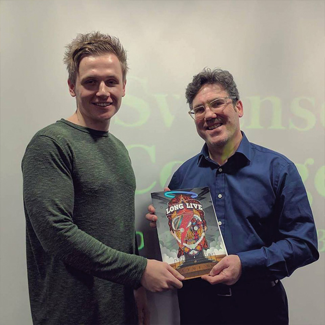
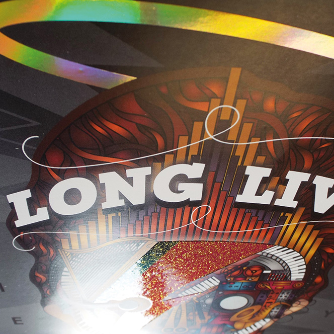
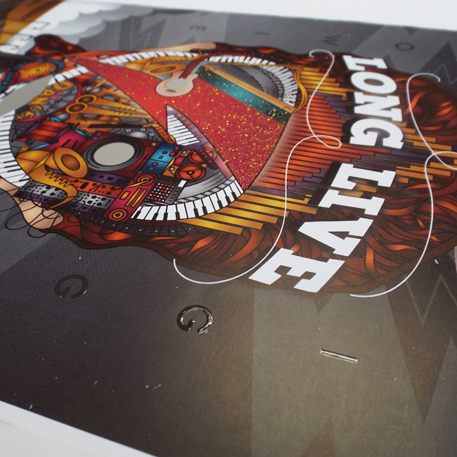
The student’s entries were shortlisted by the University down to three, who were: Joanna Green, Jordan Budd and Morwenna Chapman. After some deliberation, Celloglas chose the design of Graphic Design student Jordan Budd, and his ‘Long Live’ cover.
He said of his design “I straight away knew that I wanted to choose music [as my theme] and because Celloglas create innovative, extravagant finishes I felt Bowie fitted the brief perfectly. I also thought it would be great to see a magazine cover celebrate his life, in all its vibrancy and boldness, after his passing.”
Steve commented, “Jordan was a standout winner for us as he had really focused in on how he could bring his design to life and make it jump off the page. All the publishers we have shown it to have been very impressed and find it hard to believe it was produced by a college student.”
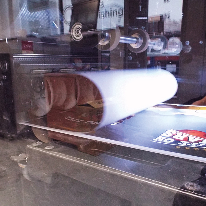
The design was digitally printed in Reading on an HP Indigo press. The sheets were then sent to our site in Leicester for finishing, where Jordan was invited to watch as the finishes were applied.
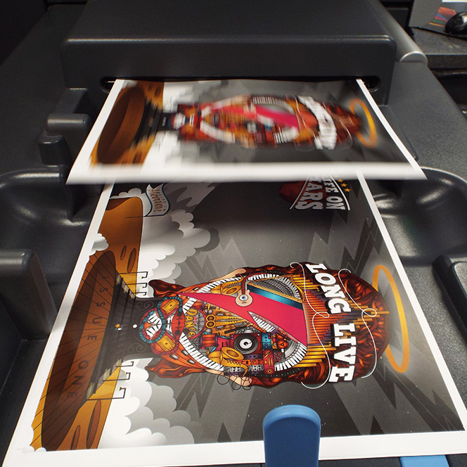
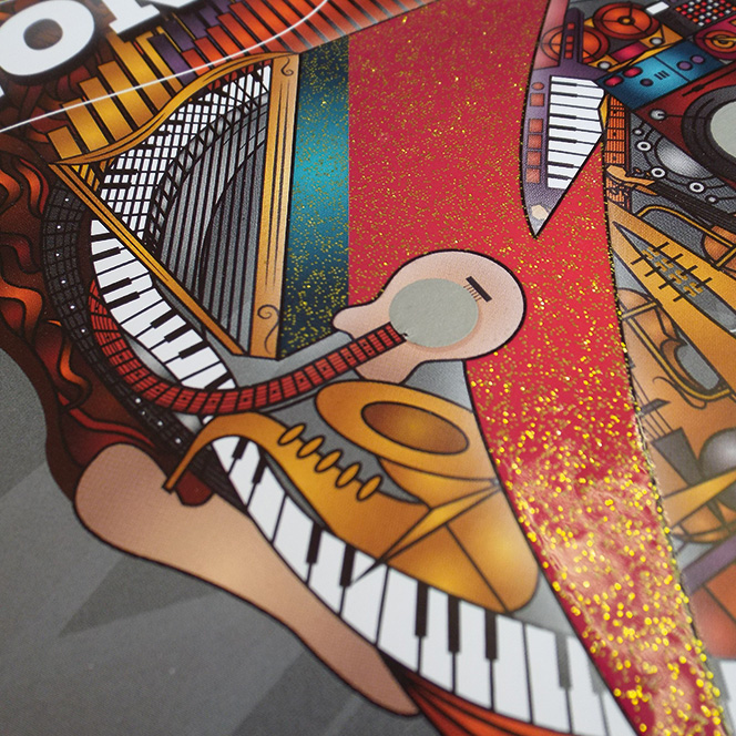
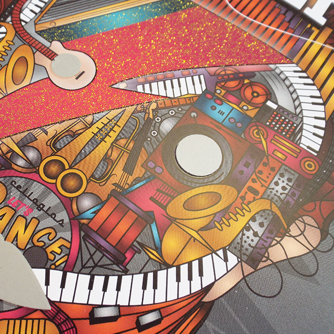
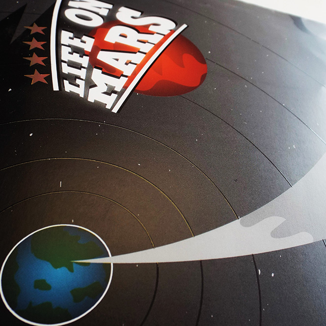
The four finishes that Jordan chose for his design were silver latex, gold foil, photochromic and glitter varnish. The photochromic elements of the design covered areas of dark print that represented a dark sky. Due to the milky colour of photochromic ink when it is laid down, we advised Jordan to reconsider this finish so as not to affect the look of his design. We opted for a spot gloss UV instead, which added texture and was a subtle but effective alternative finish that meant the look of the print was unaffected.
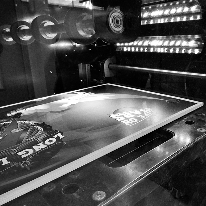
The front cover displays a glitter varnish lightning bolt:
A CFS Gold Diffuser foil for the halo:
Silver Latex on the eyes and mouth:
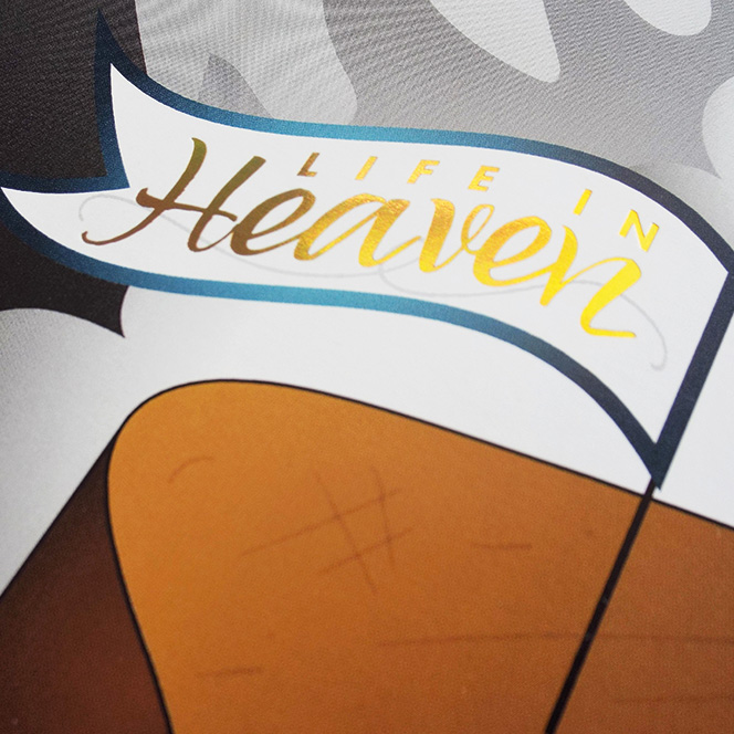
The back cover includes rings created using a spot gloss UV varnish, and the stars and words ‘Life in Heaven’ in the CFS Gold Diffuser Foil:

Posted By
Richard Pinkney