The Finishing School
Creative review use Celloglas finishes for magazine redesign
The June 2016 issue of Creative Review, entitled the ‘Redesign Issue’, sees the magazine’s latest first makeover since March 2010. The purpose of the redesign was to complement the changes in magazine content which takes a wider view of the creative industries, aimed at creative leaders and those who aspire to be creative leaders. The cover of this special issue was finished by Celloglas.
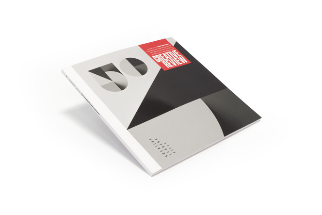
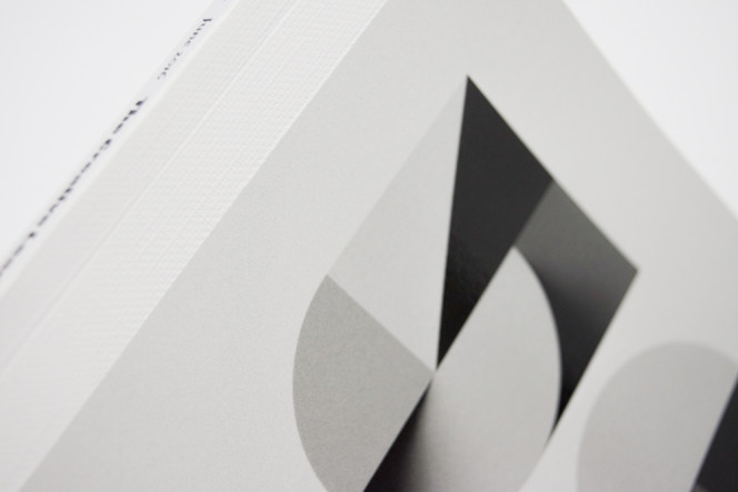
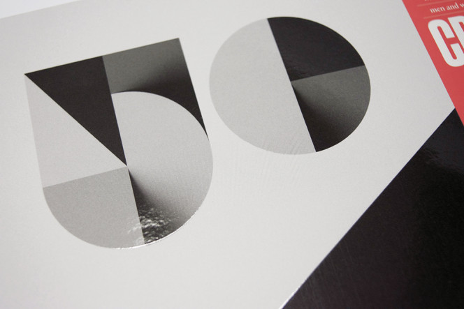
As part of the redesign, a new logo was created. It was drawn by Robert Holmkvist of Essen International using a bespoke typeface. This logo was designed to reflect where Creative Review wish to be in the future, shown through its tone and sensibility. On the cover of the issue, the new logo, along with the predominant number ‘50’ and the black section of the design, were finished with a high-build Spot UV at Celloglas Leicester. The cover also features matt lamination, a spot UV and also a textured spine, which replicates the look of wibbling used in book binding.
Steve Middleton, Sales Director at Celloglas commented, ‘We’re so glad to have been involved in such an important issue for Creative Review. We worked closely with the team and chose some great finishes that work brilliantly with their new design.’
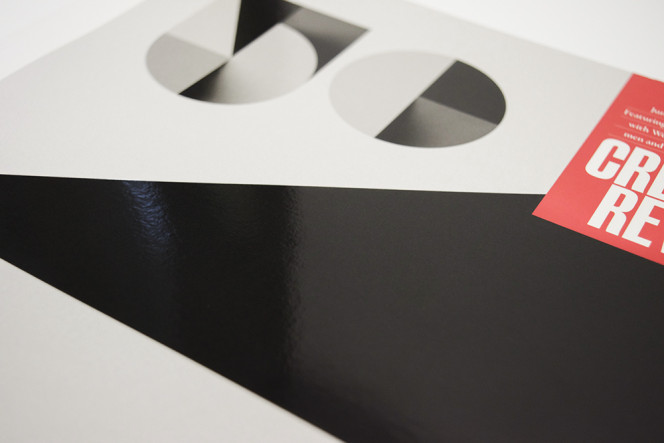
Patrick Burgoyne, Editor of Creative Review added, ‘The finishes from Celloglas have enhanced the new design brilliantly. There’s a range of textures and the spot UV has highlighted key areas of the design, such as our new logo. We’re really pleased with how well the finishes complement the redesign.’
Creative Review, the Redesign Issue is available to buy now.

Posted By
Richard Pinkney