Jul 31 Celloglas News
Computer Arts use Mirri to Create Metallic Cover for this Year’s New Talent Issue
This month sees the launch of a new creative talent, as the UK’s leading decorative print finisher Celloglas, and industry renowned magazine Computer Arts came together to showcase a student designer who impressed both parties.
Well known for creative covers, produced with Celloglas as partners, Computer Arts boasts many customers who buy the magazine to keep as collectors items, so for second-year student Camelia Pham from the Accademia delle Belle Arti di Frosinone in Italy, the opportunity for her design to feature on the front cover is an opportunity to launch her career.
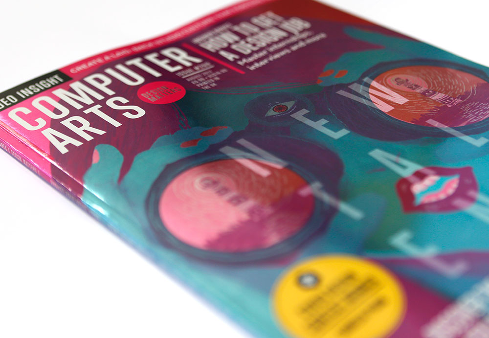
Seeing European design influence conquer, it was her ‘striking original style’ that won the judges over, alongside her bold, simple, high-impact composition that conveys the idea of ‘talent spotting’, central to the issue, very effectively. Alongside the design, the brief also specified that the front cover must make creative use of print finishing techniques, specifically showcasing the versatile qualities of Celloglas’ Mirri.
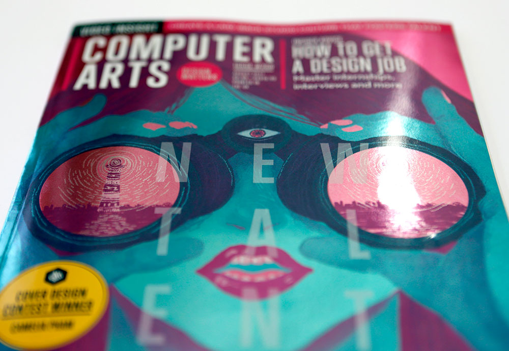
Computer Arts Editor Nick Carson said: “We felt the limited colour palette of her design would lend itself beautifully to being printed on Mirri, enabling us to use white underpin to build it up in layers, as well as giving the binoculars a shimmering reflective sheen. We loved the idea of using the reflective cover treatment for binoculars and a lighthouse.”
“The lighthouse symbolises you guys, the talent seekers, shining down to find and shed a path to us, the art community,” explains Pham. “We send you our best work with a part of our soul attached to it, as seen in the eye in the forehead, which represents the window to the soul.”
“It was a close-run thing, and the other two runner-ups were also excellent – we were struck by how many of the student entrants embraced the potential of Mirri as a material to enhance their designs.” added Carson.
Computer Arts and Celloglas run an annual design competition to help showcase creative design talent from students coming into the industry, from around the world.
Let’s Get Technical
To create this eye-catching cover, a 200g white gloss stock was supplied to Mirri, where we laminated our Mirri Pak Bright Silver film to the board. Once applied, we sent it to one of our official Mirri Print Partners, Colour Five, where they printed Camelia Pham’s design. Colour Five are a UV litho printer, which means they can print on metal based papers such as Mirri.
The trick to getting the most out of printing on Mirri is to master the white layer. Before printing the four colour process, a layer of white ink can first be applied to Mirri. This helps to build contrast and increases the readability of the design.
The amount of white ink that goes down can be varied to create different effects. By applying a solid, opaque white to the Mirri, the metallic effect of the Mirri will be completely masked and the colour you print on top will be a solid colour. By varying the density of the white ink, the boldness of the design will change accordingly and the metallic effect will alter too.
To see all of this in action, including a look at what the white layer looked like for this issue, take a look behind the scenes in our online video: https://goo.gl/5

Posted By
Richard Pinkney